
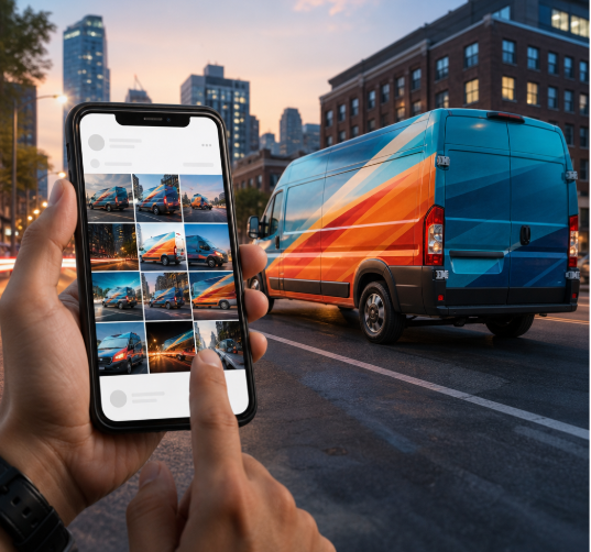
A vehicle wrap used to be measured in drive-by impressions. That is still half the story. The other half happens when someone pulls out a phone at a street fair, a job site, or a hospital parking lot, takes a photo of your van because it looks good, and posts it. At that moment your paint job becomes content, and content behaves by different rules than roadside advertising. It gets cropped, compressed, viewed at thumb size, and judged in under a second.
Most wraps are designed for the first audience and accidentally ruin themselves for the second. Fixing that costs nothing extra at the design stage and almost nothing to retrofit if you catch it early. Here is how to think about a branded vehicle as both an object on the road and a recurring prop in your feed.
The roadside viewer sees your vehicle laterally, in motion, for roughly two to three seconds, usually from twenty to sixty feet away. That reader needs five to seven words maximum, one dominant color field, and type heavy enough to hold its shape in peripheral vision. Everything the trade knows about billboard design applies: big, blunt, high contrast.
The camera viewer sees something else entirely. The photo arrives as a 4:5 or 1:1 crop, so the long flank of your vehicle, the panel you spent the most money on, is the first thing to get cut. The shot is often taken from a three-quarter angle, which compresses text horizontally and bends it around the fender. Shadows fall across the lower third. Your beautifully kerned 60-inch headline becomes twelve pixels tall on a phone screen. Design for the crop, not the elevation drawing.
One message per panel
Treat each side, the rear, and the hood as separate ads rather than one continuous canvas. A reader who photographs the back of your van should get a complete thought from the back of your van alone. Split a sentence across two panels and you have written something nobody will ever read in order.
The handle test
Put your social handle where it survives a crop: the rear door or tailgate, and again on the rear quarter panel at roughly chest height. Avoid the front doors, which get blocked by people standing next to the vehicle in every single photo anyone takes of it. Set the handle in a typeface where the underscore, period, and numeral one are unmistakable, and never run it across a seam or a rivet line. If someone has to zoom in to retype it correctly, you lost the follow.
Point the traffic somewhere that holds up
A wrap does not convert anyone. It moves a stranger to a profile, and the profile has about one line to confirm they are in the right place. This is where plenty of otherwise sharp branding collapses: the vehicle promises personality, and the bio delivers a generic string of service keywords. Regional and vernacular brands often solve this better than national ones, because a two-line couplet carries warmth and rhythm that a tagline cannot. If your audience reads Hindi or Urdu, borrowing the cadence of Instagram bio shayari gives you a line people actually finish reading, which is more than most corporate bios manage. Whatever register you choose, keep the first four words of the bio doing the identifying work, because that is all a visitor sees before the truncation.
When the vehicle has a job beyond looking good
Marketing vehicles can be judged almost entirely on how they photograph. Mobile medical and outreach units cannot. Those builds answer to clinical workflow, infection control, equipment clearances, power and water systems, and accessibility before anyone talks about graphics. Facility design bodies publish guidance specifically for these builds, and the reporting on the updated FGI guidance on designing mobile medical units is a useful orientation for teams who are used to buildings and now find themselves specifying a vehicle. The practical consequence for branding is simple: on a unit like this, exterior graphics work around fixed realities such as awnings, generator vents, lift doors, and patient entry paths. Decide those first, then design the wrap to the leftover geometry. Doing it in the other order produces artwork that gets sliced apart during fabrication.
Awkward surfaces: fleets and heavy equipment
Delivery vans are forgiving. Excavators, loaders, and boom lifts are not. The surfaces are curved, ribbed, interrupted by hydraulic lines, coated in dust within an hour, and pressure washed on a schedule that punishes cheap vinyl. They also happen to be the most photographed objects on any site, because people take pictures of machines. Getting durable, legible branding onto equipment is a fabrication problem as much as a design one, which is why it pays to work with a shop that builds vehicles and graphics under one roof rather than treating the artwork as a separate purchase.
Craftsmen Industries is one example of that model: a fabrication company that builds custom vehicles and vehicle graphics together, from mobile medical vehicles and custom mobile medical trailers to mobile experiential marketing vehicles, fleet wraps, and fleet graphics construction equipment programs covering cars, trucks, and delivery vans. The reason that combination matters is continuity. A team that has already solved panel layout, substrate behavior, and service access on the build side will tell you where a logo cannot survive before you pay to print it there, and will keep a mixed fleet of vans and machines looking like one brand instead of three.
A thirty-minute shoot that feeds a month
Once the vehicle exists, stop treating photos of it as an afterthought. Book half an hour on a cloudy day, which flattens the glare that ruins gloss laminate, and work through a short list:
- Three-quarter front and three-quarter rear, shot from roughly waist height so the vehicle looks grounded rather than toy-like
- Tight crops of the logo, the handle, and any illustrated detail, for use as profile images and story backgrounds
- One shot with a person entering or working at the vehicle, which outperforms empty-vehicle shots consistently
- A vertical frame with headroom above the roofline, so text overlays have somewhere to sit
- The same three angles again once the unit is dirty and in use, because that version reads as real
That is roughly twenty usable assets from one session, which covers most brands for several weeks of posting without a single staged studio shot.
Settle these before the vinyl goes on
Lock the handle and the bio line before you approve artwork, not after, because the wrap outlives whichever name you pick. Confirm which panels are legally or operationally untouchable, especially on medical and utility builds. Print a letter-sized proof of each panel and look at it from fifteen feet to test the headline, then look at it on your phone to test the handle. Ask the fabricator how the graphics behave after a season of washing and sun, and plan for panel replacement rather than a full reskin. A vehicle built this way keeps working whether it is passing someone at forty miles an hour or sitting in the background of someone else’s photograph.